Tuesday, 29 November 2011

After Effects Numero Un


This is a very important window it allows you to see the different programs you can open and can choose which windows are.

New composition instead of new document. could open more than one comp at an time. choose size, resolutoin etc just like photoshop. 


NTSC american. Pal is the English option. the main difference is the fames per second. 24 frames is the traditional frames for film. 
Even when you have made your composition it is editable and you can change the setting in the composition menu. 


Similar to photoshop there is a layers menu. 


You can zoom in on the time line by moving the orange bars on the right hand side. 

The red bar controls how long the object will be in the video. 


You can change all the yellow values and it will edit the selected layer. 


Tuesday, 22 November 2011

Evaluation


  1. What skills have you developed through this module and how effectively do you think you have applied them?
I have developed my knowledge of print greatly already this year. I am more understanding of colour matching, print techniques and finishes which as been very helpful in pushing my designs forward in the sense of professionalism. I have also expanded my design knowledge and the processes used for different printing by looking at specific printing methods and visiting professional printers. I would of liked to explore more printing methods and I plan in the future to look extensively in increasing my skills further.


  1. What approaches to/methods of design production have you developed and how have they informed your design development process?
My methods of design have become more towards colour matching my work using pantone to create consistency in my work. My knowledge of the printers in the mac suits and knowing what stocks can be put thought the printer and how the ink will sit on the paper has been very helpful in keeping the costs down and meant I could avoid just using the digital printing room.


  1. What strengths can you identify in your work and how have/will you capitalise on these?
The strengths in my work is the inventiveness of the packaging design and doing as much research around the subject relaxing as I could. Been informed made it possible to apply this to my designs such as using magnets not using fiddly flaps etc. I am happy with the logo design and went through about a million design ideas to reach something I was happy with. I feel like I have managed my time more efficiently but there is stillroom for improvement.


  1. What weaknesses can you identify in your work and how will you address these in the future?
My weaknesses are working mainly on screen. I know I can draw I enjoy drawing but I just didn’t do as much as I would of like to. I also feel I could of pushed my design further and I’m really annoyed that I didn’t. Something I would of like to do is develop my packaging more I just needed more time with the magnets so I could use them to there maximum efficiency and its turn out to be a bit shabby.


  1. Identify five things that you will do differently next time and what do you expect to gain from doing these?
Push my design further. I know I can I have the tools to do this and I would be more satisfied with my work if I did so.

Look into more print finishes. I want to be able to utilise all the facilities around me to add a professional finish to my work.

Manage my time more efficiently. I feel I am improving with every brief but there is still much more room for improvement.

Blog more often!

Explore more into stocks and printers to get the most out of my work

Monday, 21 November 2011

Final Issuu

Final Products


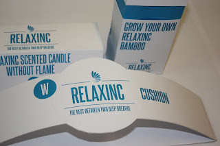
Here are my final products finished and photographed. i am happy with the way that they have turned out and think the acetate layer really finish them off. They magnets were a really good idea i just wish i could have executed it more professionally and had time to develop that idea.

the packaging is simple using a cheap standard stock then adding my own spot varnish kept the cost down and duoplexing onto a thinker card kept the stability the packaging needed. so i kept it cheap which was every necessary in my current financial state and also made me explore different methods of working instead of just going down to the digital print which is what i would usually do.


Here are some edgy photographs with the packaging in a relaxing environment. Think i like my fish tank to much really.

Magnets

I finally got my magnets after about a million delivery attempts. they were a great deal smaller than i expected so i would have to be very accurate with where i place them together.

I put the magnets in-between the two stocks so they are concealed. the magnets work a treat on this first packaging but not as well on the other two designs.

if i had more time i would have experimented with the best way of lining them up and maybe developed the other packaging to accomodate magnets better.
in saying this i am still happy with the way they have turned out.

Making Of

Here are some picture i took while making of the packaging. it all went smoothly and the only hiccup was lining the magnets up, which i talk about in the later post

Poster Design


Just some simple designs to go in busy city areas where the majority of people are effected by stress. the main focal point been the "WE CAN HELP" surrounded by the effects of stress. which instantly would make people think how serious stress illnesses are. 
 

This one above is my favourite. the composition works really well and the viewer reads it in the most influential order to have the biggest impact. 


Sunday, 20 November 2011

Advertising designs

Some quick mock ups of what my outdoor advertising would look like. i used photoshop to do this. if i had more time i would of liked to actually print them. 


Iphone App quick mock up

Here is a quick mock up of the App i proposed at the start of the project with a couple of examples of things that would be on it. i have put the aquarium and the lava lamp. if i had more time i would of like to look into this more


Adding To my packaging Series.


I wanted to design a simple attractive pattern to go onto my packaging series just to cover some of the huge amount of white space. I came up with this. using the tonal colours from the symbol of the logo i made this tiling effect.
I applied this to to a packaging and printed it out on the standard printing paper i intend to use. The effect isn't what i desired.
It is just to vibrent printed onto the white stock. This gave me an idea though. i plan to print onto acetate and produce a cover to go around my packaging. This is how it turned out. 

the different tone work well o acetate as they become more transparent. i really like the way this has turned out and i plan to wrap this around my packaging just to finish them off and remove some of the white space. 

Flyer Designs


Open publication - Free publishing - More designs

Here are my initial flyer designs. Again keeping it nice and simple i hope to have them double sided on a rough stock with the kind of recycled look about it. slightest off white.
My main idea is displaying all the negative effects of stress and putting them all together with just "We can Help" whited out and overpowering the negative effect behind it.

Experimenting with Printing methods.

I really want sure which printing method would be appropriate with i didn't think foiling would look right even if i chose a coloured one they are just to in your face for the look i am after. My friend will was talking to me about spot varnishing and that he used clear nail varnish and a small brush. i wanted to follow this up and give it a go myself but after visiting the Screen print technicians they gave me a nice quick and cheap method of getting the finish i desired.
You can buy a foil which is transparent and give a spot varnish effect to wherever there is ink on a page. This is perfect as i don't have a coloured background so don't need to alter any of my designs.
I just cut the foil to size and put under the heat press for the recommenced time which is 15 seconds. the outcomes where about 50/50. a lot of the time the foil wouldn't stick properly. The ones which actually worked did exactly what i wanted. just to give it a nice subtle shine which just adds a professional finish to my work. 

Final Crit

From the Crit with my Class mates i was left some good advice by them how to just finish off my work. The colours and the design where much to be praised which i am happy with. Thing to look into are to consider some print finishes. i feel this is a very sound piece of advise an i will look into this.
they like the idea of the innovative products but wanted to see some information on relaxing and why they are useful.
they want to see a leaflet of something to inform people also. i would like to do this, i plan to start looking into this if i have got the time.
need to consider where my products will be stocked.

Product Designs


Here are the 3 products i packaged for the final crit i ran out of time to finish the the USB lava lamp but i will make sure i show my designs for it in the crit. i am happy with what i produced but i would like to see what other think of my work.