Thursday, 26 May 2011

End of Module Self Evaluation

01. What skills have you developed though this module and how effectively do you think you have applied them?
I have developed my skills in InDesign as i have never used it before. i wouldn't say i am totally comfortable on it but i have got the basic down which is all i needed for the Brief.
Potentially i have improved more on my illustrator again.

2. What approaches to/methods of research have you developed and how have they informed your design development process.
I still struggle with my research and tend to do the minimum. i need to do more so my products and designs can look to my full potential. i have also found out updating my design context is the most useful tool i can have developing my knowledge.

3. What strengths can you identify in your work and how have/will you capitalise on these.
I have noticed when i use photoshop these are the project which work out the best and produce the best outcomes. i feel this is because thats all i used to use before this year so my illustrator needs to catch up.
i have greatly improved on every aspect of my work since the start of the year.

4. what weaknesses can you identify with your work and how will you address this more fully?
My weakness is my research and development i just need to spend more time in these areas and i feel my grades would improve greatly.

5. Identify five things that you will do differently next time and what do you expect to gain from doing these?
1. Blog more of my research and drawing.
2. do more development on paper rather than on screen.
3. keep up my standard of design
4. organise my time better
5. buy a sketch book


How would you rate Yourself?
Attendance 5
Punctuality 5
Motivation 4
Commitment 4
Quantity of work produced 4
Quality of work produced 4
Contribution to the group 4

Speaking From Experience

What is been communicated and how.
I am communicating problems that us Graphic design students face when we start university and how to solve them in an interactive way.

How well does it answer the brief?
i feel i am answering the brief although my product could relate to all students and the information provided isn't specific to Graphics. i have tried to solve this by using graphic's term such as cmyk and had the logo abbreviated from Graphic Design.

How well has the idea been visually explored
i looked at a lot of different ways of making my information more interactive. i decided on making nets for the students to make which i feel has work out well and appealing to my target audience. i experimented different methods of putting the nets together and also with different stocks to see what works.

What are the strenghts of the resolution?
My strengths are my final outcome and how they have turned out. i stepped away from the conventional flyer or poster and made interactive objects. this was risky as if they were to complex they would be useless and couldn't be made by the user but if to simple it would be boring and a waste of time.

How could it be improved?
It could be improved by possibly creating a packaging for the set of flyers. I also feel i could of pushed the designs more but i kind of just hit a brick wall with that aspect.

.
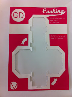
these are the final nets made from the cartridge paper and all are perforated to that doesn't effect how the they are made. they are both structurally stable and easy to make with no extra effort needed such as glue or scissors. i am very happy with the way they have turned out.

Tuesday, 24 May 2011

InDesign

This is my final magazine double page spread. I am impressed with the way it haas turned out, it defiantly has a modern feel to it and which i feel is mainly from the wooden effect i feel. The colours i used where the right choice because the main focus is the magazine and the clothes that Steph's wearing and also her hair colour.

InDesign


i really didn't enjoy the colours of the magazine so i decided i like the wood effect when i was initially working with the magazine on photoshop so i decided i would see what i looks like on the double page spread.
i then put the magazine into indesign. i also used the same font as on the magazine for the headings for the pages. i used a 6 grid system for my designs.
i then experimented with putting some of steph's work on the pages also. i found that it just didn't look right and gave this idea up.
This is where i add the curvature to the letters using the warp transform again.
Here i have split the photo up into two so to make it look like 2 pages. i used to warp transform to add some curvature on the photo so it follows the pages. The text now needs to change to make it look more projectional.
This is the chosen image for the magazine and it doesn't look like part of the page yet.
Here i took a picture of a creative review and then went about the job of removing the current articles. i did this in photoshop using the clone and brush tools. this was a very simple step and putting my images on and making them look like part of the page is the bigger task.

This is my second idea where on which there is a magazine in a magazine. this is where i would put the pictures of Steph and here work. i feel this is a very interesting way of laying out my double page spread and i feel i am going to peruse it further.
Here is my first idea was to experiment with bunting and making it with a modern feel. i used fonts which Steph said she liked and kept the colour nice and simple. i would have large photos in the white space of Steph and here work.

InDesign

My drawings for the InDesign workshop with Lorenzo. i am please with my results and feel they look appealing and of a high standard. i feel my regular designs were better than the irregular as i didn't really grasp irregular properly and the are still very structured.

Irregular

Regular

Monday, 23 May 2011

Fun Shop WIth John

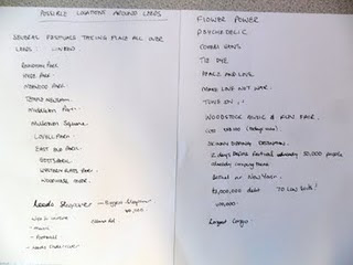
As a group we talked about all the different things we would like in a festival. There were suggestions such as music, bar, comedy, film, theater, food. Then after speaking to John bout our ideas he just told us to "GO BIGGER"
so we tried to do just that. we talked about shutting the whole of leeds city centre down and have different areas for different activities.
Obviously students don't want to do the same as children and the same for adults and the elderly. they all have there own idea of fun. so there would be areas for students to go mental in where there is music on till late bars etc the for a family area with projected children films on a projector. On to top of that there is an area just for food where there will be loads of different origins of food on display for free which the local businesses could provide which would produces advertising for them.
To connect these areas up we want a big sky projection of what is happening in the rest of the city so if people wish to move they know whats there.
We decided on the name "The Big Sleepover" as after it all finished there would be tents on which you could then sleep in.


Speaking From Experience

These are my final designs printed on cartridge paper which is a good thickness for bending and also perforating. I used the printers in the Mac suit and i am surprised at the quality as a thought it would be much worse. i found some problems when folding the paper as some of the in would peel off it wasn't a problem for any of them apart from the black safe as all of the rest are white. They work well as a set which i am pleased about.


Speaking From Experience

With the new tabs slotting in method in-place i found structurally it wasn't stable or the correct shape. i intend to solve this by simply making the tabs larger so having more hold ad keeping the models shape better.


Again to make the nets more simple to make i don't want the students to have to put any more effort than they have to because you don't want to be cutting up objects for know reason so i intend to perforate them so they just pop out.

Speaking From Experience


I wanted making the models to be as easy as possible so instead of fafing around with glue i wanted little taps which would slot into a slit in the corresponding flap. which then solves having to use glue.


The yellow print came out a bit funny as it was streaky and left sections of colour out. i feel this is due to the printers standard and not the colours used. hopefully!

i Printed out my set of designes to see how they looked printed. i used my own printer and standard A4 white so the quality wasn't great at all.

Speaking From Experience

So for the cooking section i simply just went with the cooker and used the same net as the washing machine.