
Monday, 27 December 2010
What if iPhone app
I made an iPhone app which i feel would appeal more to students as its easier to carry and a modern idea which the majority of students could access due to the high number of smart phones available.

What if Map
We gave our map out to the public to see how people would react to it. we got a positive result and found out it would be something our target audience could be interested in.


 This is the map i created. its a simple easy to read design with clear descriptions of the attractions so you can go to the ones which appeal to you personally. it also doubles up as a poster on the back.


 This is the map i created. its a simple easy to read design with clear descriptions of the attractions so you can go to the ones which appeal to you personally. it also doubles up as a poster on the back.
What if Posters
this is how the advertising posters would work in the outside world next to other posters.


These are a few poster designs which we experimented with to raise awareness about the project and to get a bit of a buzz about it.


These are a few poster designs which we experimented with to raise awareness about the project and to get a bit of a buzz about it.

What if Logo
We experimented with a few different designs but went with the simple black on white which i feel looks crisp and effecive


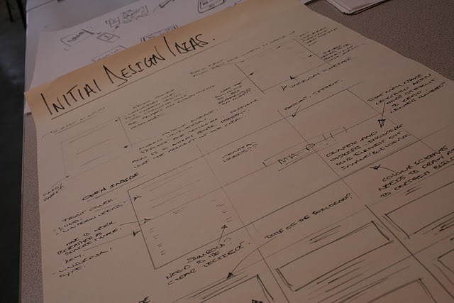
What if Design Sheets
we produced a number of design sheets where we started to jot down a few ideas of how we would produce our product and also layouts.


What if Photos


Here we all found some areas which we feel students would like to visit on a low budget.
What if Questionnaires
Our group produced a couple of questionnaires to find out if our problem was actually worth wile pursuing. We asked questions about existing tourist attractions and find out if they appeal to the student market.
We found out that a separate student tourist guide would be a good idea and the current attractions aren't what students want to visit.


"What If" Rational
Group members:
Matt, Sam, Marty, Max, Michael
Problem:
The problem is the tourist guides aren't directed to the student population so how to direct students to interesting/creative/cool areas in Leeds, unseen by the majority.
Evidence:
Photographs of obscure locations clearly reveal that there is more to Leeds than your average tourist information guide.
We aim to:
Highlight these areas and explore the possible ways of directing students towards these.
Monday, 22 November 2010
End of Module Self-Evaluation
What skills have you developed through this module and how effectively do you think you have applied them?
I have developed my skills using Illustrator greatly as i have never really used it before this year at all. i now feel i am comfortable using it and find it much better than Photoshop which is the program i used to use for everything. I now tend to use Illustrator as my main piece of software so have found the Illustrator brief very useful to get me using it properly. i have also developed my skills in evaluating work properly for doing the Crits, which i feel is a useful skill needed in graphic design.
What approaches to/methods of research have you developed and how have they informed your design development process?
i have found i have been developing my ideas a lot better than i have previously in my foudation year and A-level where i pretty much just produced a final piece without development. i have used both sketchbooks for quick drawings and also design sheets where i jot down my way of thinking clearly. i am still not 100% used to working in this way but i am determined to get fluent at it by the end of the year.
What strengths can you identify in your work and how have/will you capitalise on these?
I feel i come up with good ideas very easily which helps during the first stages of development instead doing loads n loads of development to get an idea i concentrate of making my idea better. i am also very confident on software so can produce very visually appealing designs.
What weaknesses can you identify in your work and how will you address these more fully?
i am quite lazy i tend to leave things to the last minute and do the bare minimum of work but i feel i have addressed this and attempted to change. i'm not quite there yet and still feel there is a lot of room for improvement. i also have problems with attention span and get easily distracted but the main problem is probably time keeping and organisation skills although i am improving it still requires improvement.
Identify five things that you will do differently next time and what do you expect to gain from doing these?
1. I won't leave my blogging to last i will try and blog as i do something new so it shows and accurate timeline of development.
2. I plan to time keep better so i distribute my work evenly instead of doing it all a few days before the deadline.
3. I wish to do more work at home as i tend to mainly do it at college only.
4. Develop my ideas better as i still tend to get one idea in my head and pursuit it.
5.
Attendance 4/5
Punctuality 4
Motivation 3/4
Commitment 4
Quantity of work produced 3
Quality of work produced 3/4
Contribution to the group 3

Illustrator Brief
These are all my illustrator designs i will no pick out my favourite to print out.


Sunday, 21 November 2010


No News is Good News Mailshot
The printer messed us the colour on my first attempt and printed areas yellow instead of red.


No News is Good News
i came up with a way of reversing the mailshot around so the adress is on the outside when posted but can be flipped easily to show a bouble sided information and still keeping it structually solid. have 2 mushroom shaped tabs on one side then two slits in the over which they can slot in to. this means it can revese also. 
No News is Good News Mailshot
my plan was to have he address on one side and the information on the other and securing it with glue so all the user need to do is pop it open and its complete. i was happy with the simplicity but i feel it needed to have information on both sides or people will be just looking at the boring address on one side.i am not sure howw i can achieve this simplisty and make it more practiacal. 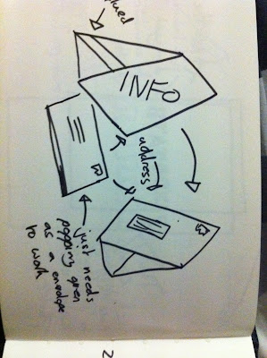
No News is Good News Mailshot
my second idea was to have a stencil cut out which makes it a bit more exciting to look at. but i felt it may not survive going through the post and be eaily ruined. i now descided i will keep it simple and direct without trying to complicate things more than needed. 


No News is Good News Mailshot
this is one of my ideas where i was to perforate a line which had the address on but when torn off it had information underneath and worked as an advertising stand.


When the stip was taken off the stand lost it structural capabilitis so its stop working and i decided to follow different ideas.


When the stip was taken off the stand lost it structural capabilitis so its stop working and i decided to follow different ideas.

No News is Good News Mailshot
i quickly found a design which i liked so i tested it out by making it up to see if it was as effective and worked as 3D. 

No News is Good News Mailshot


Here is a design sheet of my first ideas for my mailshot. i wanted to keep it simple and effective and not have it to complex and over the top. i want to concentrate on the message rather than the design.
No News is Good News Poster Series

After the crit a few issues and ideas were arrised such as the image only poster wasn't toally clear it was a heat beat sensor at first so to solve this problem i put a heat beat inbetween each pint glass.
No News is Good News Poster Series

Here is my final mock up which i will take to the crit i feel it has worked really well. my only consern it that the posters don't work individually they need to be in a series in the correct order.
Subscribe to:
Comments (Atom)